Every Morning, the Report Already Knows What Needs Fixing
How I built an automated lead performance report that replaced manual pre-meeting calculation with an email that arrives before anyone opens a laptop.
Picture the scene.
A room full of people in a meeting. The performance dashboard is open. So is a Google Sheet. Someone is running quick calculations, a spreadsheet here, an AI tool there, trying to get to the number fast enough to be useful.
Everyone is trying. Nobody is deciding yet.
This was the opening of every lead generation review. Smart people doing their best with what they had, and still spending the first ten minutes of every meeting running numbers instead of making calls. That’s not a people problem. The system just wasn’t built for it.
The answers always came. But they always came late.
That wasn’t the worst part.
The data was already old
The dashboard pulled numbers till the previous day. Data for today wouldn’t show up until after midnight. So every morning meeting — the one where you’re supposed to course-correct before the day gets away from you — was running on information that was already hours old by the time anyone looked at it.
We were doing real-time math on yesterday’s numbers. And acting like that counted.
I’ve been running social media operations long enough to know what a real-time decision feels like, and what a delayed one costs. A lead category tracking at 65% on Day 10 is recoverable. The same category at 65% on Day 25 isn’t. The window to act matters. And every morning we were showing up to the window hours after it opened.
The thing nobody says out loud
Nobody says this out loud. Someone has to be the one who knows the numbers. They’re always slightly under pressure to have them ready. They open the sheet, run the figures, try to remember which POC owns which category, and present while everyone else waits.
That person’s job in that moment isn’t strategy. It’s data retrieval.
Data retrieval is a computer’s job.
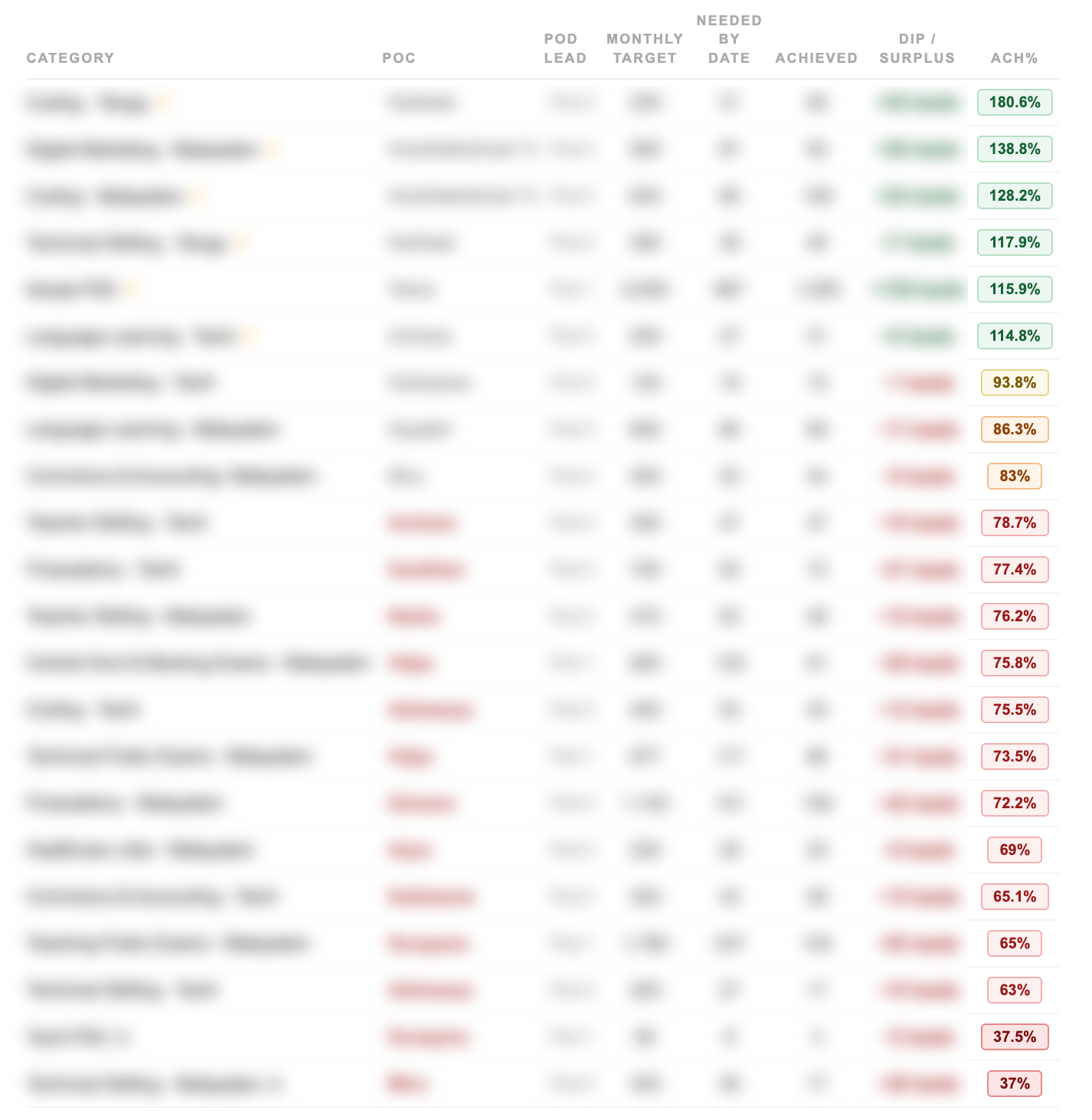
Say you have 25 active lead categories. Each with a different owner, a different monthly target, a daily run rate that shifts as the month progresses. Now someone has to walk into a meeting and have all of that calculated, current, and ready to present. Every single morning. The calculation is doable — but doing it manually, before a meeting, under time pressure, is a design failure dressed up as a routine.
I started thinking about what the meeting would look like if everyone already knew the numbers before they walked in.
What I actually needed
Not a better dashboard. We had a dashboard.
The problem wasn’t visibility. It was the gap between data existing and data being useful. Processed, ranked, delivered to the right people before they need to ask for it.
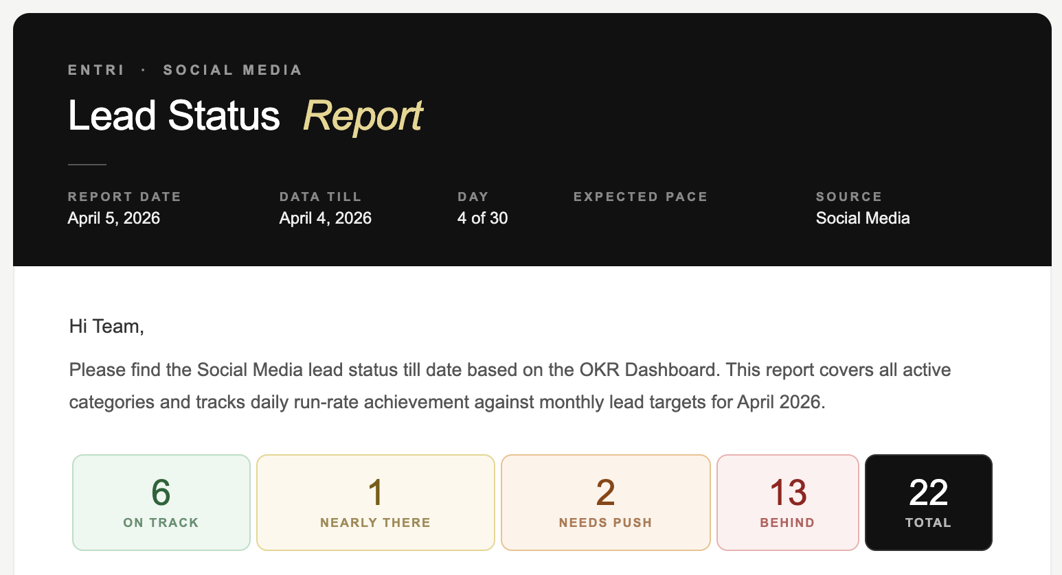
I wanted one thing: an email that lands every morning before the first meeting. Not a data dump. A briefing. The kind a sharp analyst would prepare — except it shows up automatically, every single day, whether anyone remembers to ask for it or not.
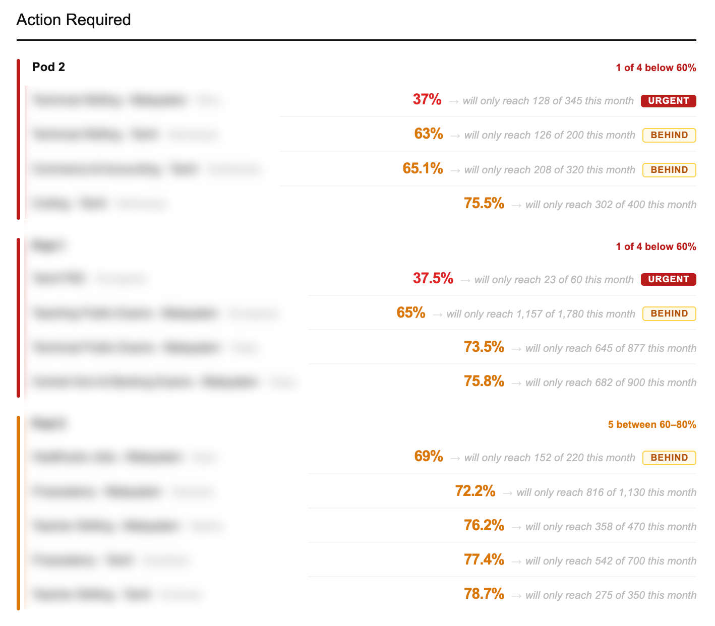
Which categories are bleeding. Who owns them. How far behind. Where they finish if nothing changes today. In that order, by urgency. Not alphabetically. Not by team. By how badly they need attention right now.
That’s it. The whole idea. Completely obvious once you say it out loud. Completely missing from how we were actually operating.
Building it
I built the whole thing with Claude Code. No data team. No engineering backlog. Just a clear problem, a clear output, and enough iterations until it worked.
The logic isn’t complicated once you write it down. Take the data. Calculate how each category is performing against where it should be on this specific day of the month. Not the monthly target, but the expected pace right now. Rank by gap. Flag the owner. Project the finish. Send every morning before the day starts.
What took time was getting the projections right. Not just “you’re behind.” More like: “at this pace, you’ll finish at 71% of target by month end.” That number is what changes a conversation. It turns “we’re a bit behind” into “we will miss by this much unless something changes today.”
That specificity is what makes people act. Vague warnings get noted. Precise consequences get addressed.
What the meeting looks like now
People walk in already knowing.
The email is already there when the day starts. Everyone’s seen it. The categories that need attention are identified. The POCs already know they’re flagged. Sometimes the problem is already being addressed before the meeting starts.
The meeting became what it was always supposed to be. People making calls, not running the numbers.
The data still updates at midnight. That part didn’t change. But the gap between numbers existing and the team being ready to act on them collapsed to nothing.
That’s the only gap that actually mattered.
More on this: Monitor Instagram Stories Across 25+ Pages · Build Chrome Extensions Without Coding · What Vibe Coding Means for Non-Developers
Common questions
Why not just fix the dashboard to update in real time? That would solve the data freshness problem but not the processing problem. Someone still has to open it, read it, calculate the gaps, identify who’s behind, and summarise for the team. The bottleneck isn’t the dashboard — it’s the manual steps between data and decision.
How do you handle multiple POCs across different categories? The system maps every category to its owner. When something is flagged, the name is right there — no cross-referencing, no asking around. The value isn’t just knowing what’s broken. It’s knowing who to talk to about it before the meeting starts.
Can you build internal reporting tools without a data or engineering team? Yes. The hard part was never the code. It was thinking through the rules — what counts as behind, how to project a finish, what order to surface things. Once you’ve worked that out, describing it to Claude Code takes ten minutes.
How do you automate a daily performance report for a sales or lead generation team? Start with the output, not the build. What does the team need to know, and when? Write it out like you’re briefing someone. Then build logic that produces exactly that — pulls the data, calculates, ranks by urgency, sends on a schedule. The report should arrive before anyone thinks to ask for it. Anything less isn’t finished.
What is a lead run rate and how do you calculate it? Run rate is the daily pace a category needs to hit its monthly target. Target is 300, month has 30 days — run rate is 10 per day. On Day 15, you expect 150. If you’re at 100, you’re at 67% of pace. At that rate you’ll finish at 67% of target. That projected finish number is what makes people actually do something about it.
How do you replace manual pre-meeting calculations with automation? Watch what someone does before the meeting. What do they open, what do they calculate, what order do they walk through it? Write that down. Then build something that does exactly that on a schedule and sends it before anyone has to ask. The goal isn’t a better dashboard. It’s closing the gap between data existing and the team being ready to act on it.
What should a daily OKR status email include? The most useful format: overall status at a glance (how many categories are on track vs behind), then a ranked list of categories that need attention, sorted by urgency, not alphabetically. Each entry should show the category name, the owner, the current achievement percentage, and the projected month-end finish if nothing changes. That last number, the projection, is what drives decisions. Everything else is context.
Same approach, different problems — Chrome extensions that pull data from locked dashboards and an Instagram story monitoring system that runs without anyone checking it.